|
found colour wheel overview: In this project, we will be creating our own ‘colour wheel’ using everyday objects in our environment. The way that you construct the colour wheel is up to you. Be sure to look at the instructions below so your colour wheel has all of the requirements. what you have to do: follow the instructions! you may lose marks for not getting things done as listed below. 1 First, plan out the parts you have to have in your colour wheel A colour wheel has primary colours: blue, red and yellow A colour wheel has secondary colours: green, orange and purple A colour wheel has tertiary colours: blue/green, yellow/orange… there are 6 of these. 2 How many different objects will you need? There are 12 colours = at least 12 objects but there could be a lot more!!! The colour wheel should have a balance of colour - not too heavy of one colour (ex. too many blues) 3 Where will you find your objects? - in the pantry, in the junk drawer, in the bathroom, recycling bin, refrigerator? 4 How will you take the picture of your colour wheel? Will your objects lay flat on the surface or could you arrange it sculpturally? 5 Find a way to stabilize your camera/phone so the pictures are in focus. 6 Make sure you think about the best lighting when setting up your picture. part two -yup, wait, there is more! Now that you have all of your objects I would like you to take a selection of them and build a new image- a circle within a circle. Our artist of inspiration is Wassily Kandinsky, a Russian born artist who pioneered abstract art in the late 19th and early 20th centuries. You will be recreating ONE of the ‘squares with concentric circles’. con·cen·tric /kənˈsentrik/
Wassily Kandinsky - in 1913 Kandinsky painted ‘Farbstudie Quadrate’, or in English, ‘Squares with Concentric Circles’. “Perhaps, Kandinsky's most recognizable work, is not actually a full-fledged picture. This drawing is a small study on how different colour combinations are perceived that the painter used in his creative process as a support material. For Kandinsky, colour meant more than just a visual component of a picture. Colour is its soul. In his books, he described his own perspective on how colours interacted with each other and with the spectator in detail and very poetically. Moreover, Kandinsky was a synaesthete, i.e. he could ‘hear colours’ and ‘see sounds.” From https://www.wassilykandinsky.net/ what you have to do: 1 Kandinsky’s circles are concentric - they share the same center. You will have to construct at least four circles that share the same center. In the sample below I used five objects = five circles that share the same center. 2 Think about the background ‘square’ colour and be creative in making it a colour as well. 3 Kandinsky did use black and white. You can too but there must be colour! 4 When taking your photograph, crop the background so the image concentrates on the circle. Center your middle so it looks like a bullseye of a target. 5 After you shoot and are happy with the images, create a .pdf file so the page is 8.5” x 11”. Set the pages to landscape or portrait depending on what best suits your images. - Page 1: your colour wheel photo - Page 2: your concentric circles image. 6 Submit your 2 page .pdf on Friday June 5th. Please submit work to [email protected] What are you marked on: -How much effort did you put into selecting the objects of colour? -How much effort did you put into setting up the objects to be recorded in each of the photographs? -How is the lighting and picture quality? -Did you follow the instructions listed above? 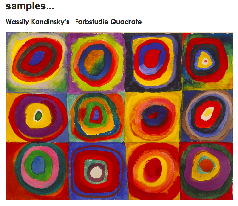 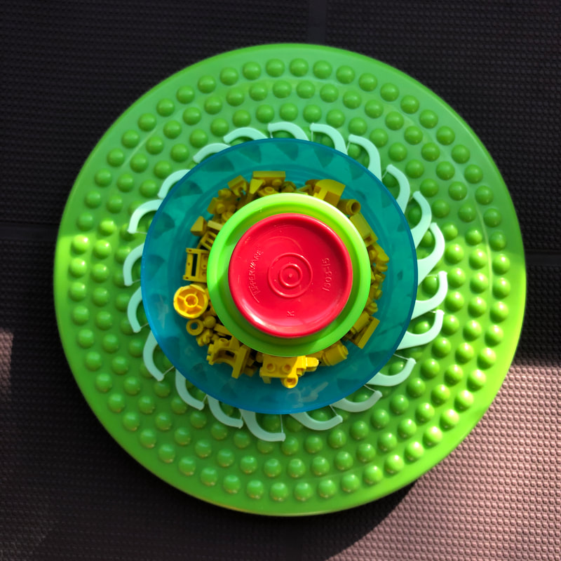 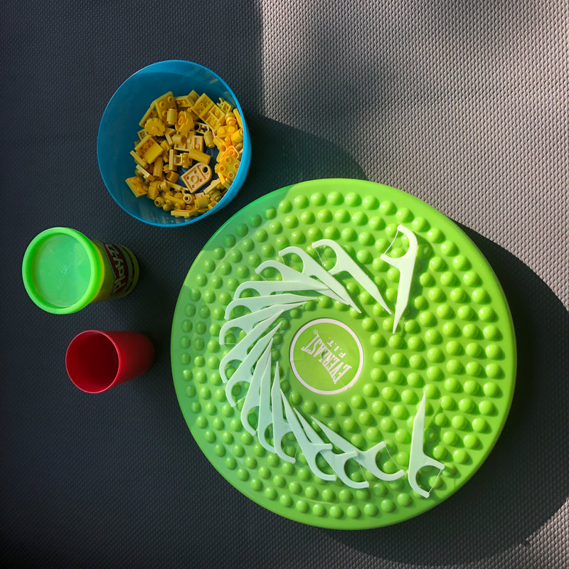
0 Comments
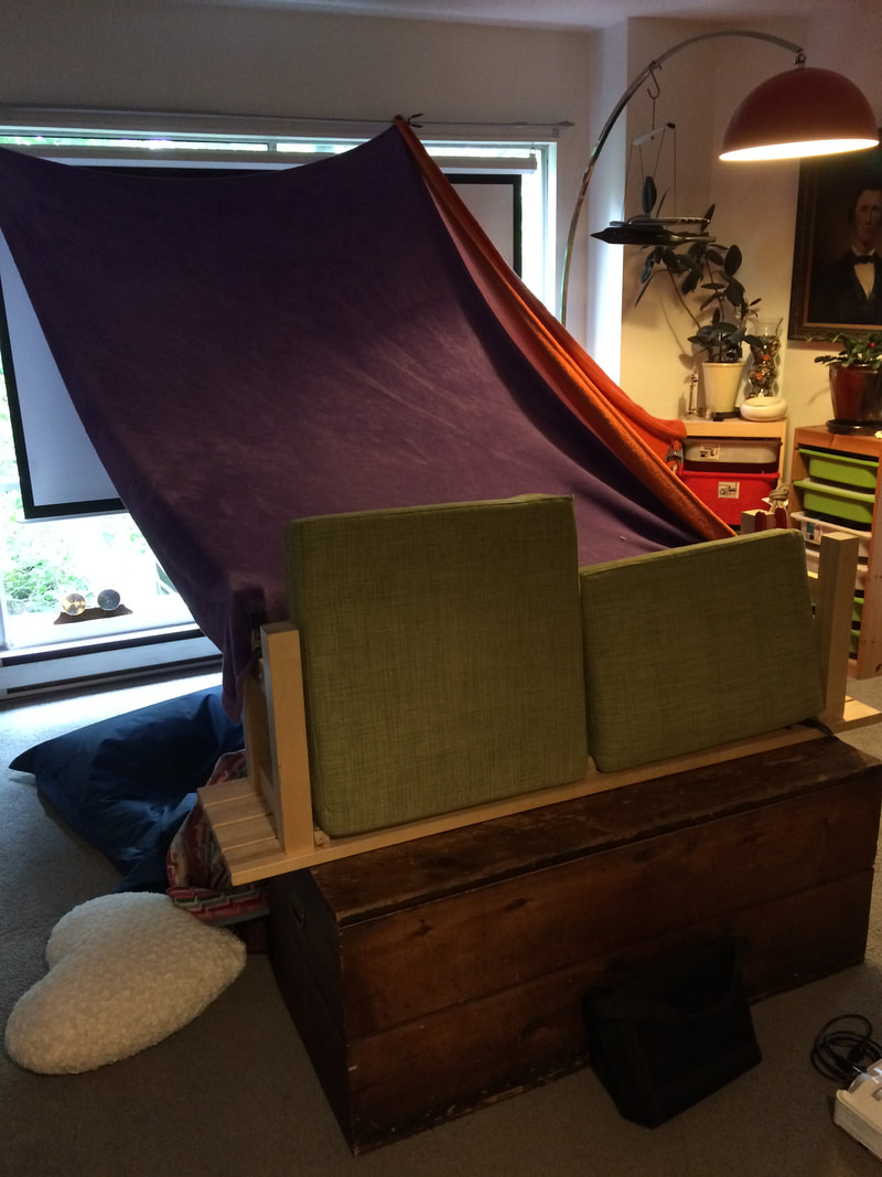
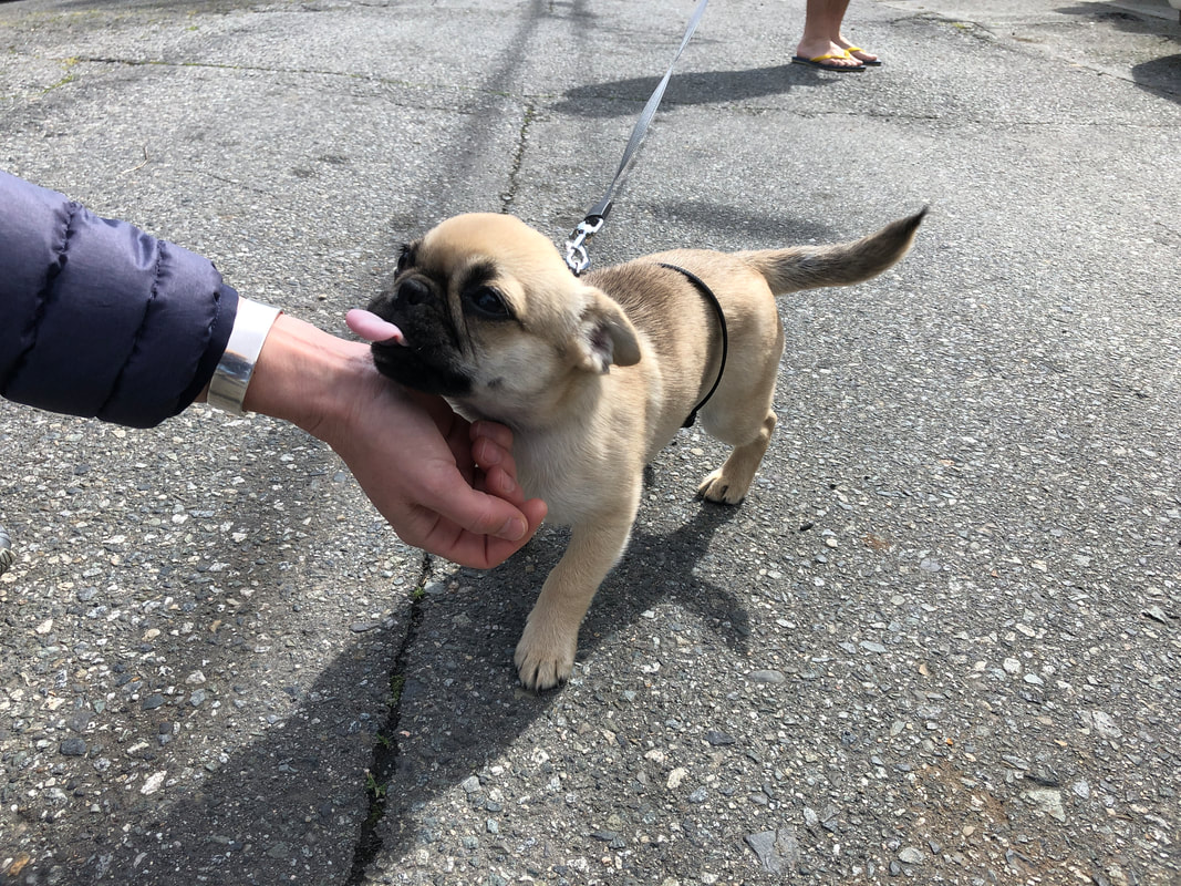
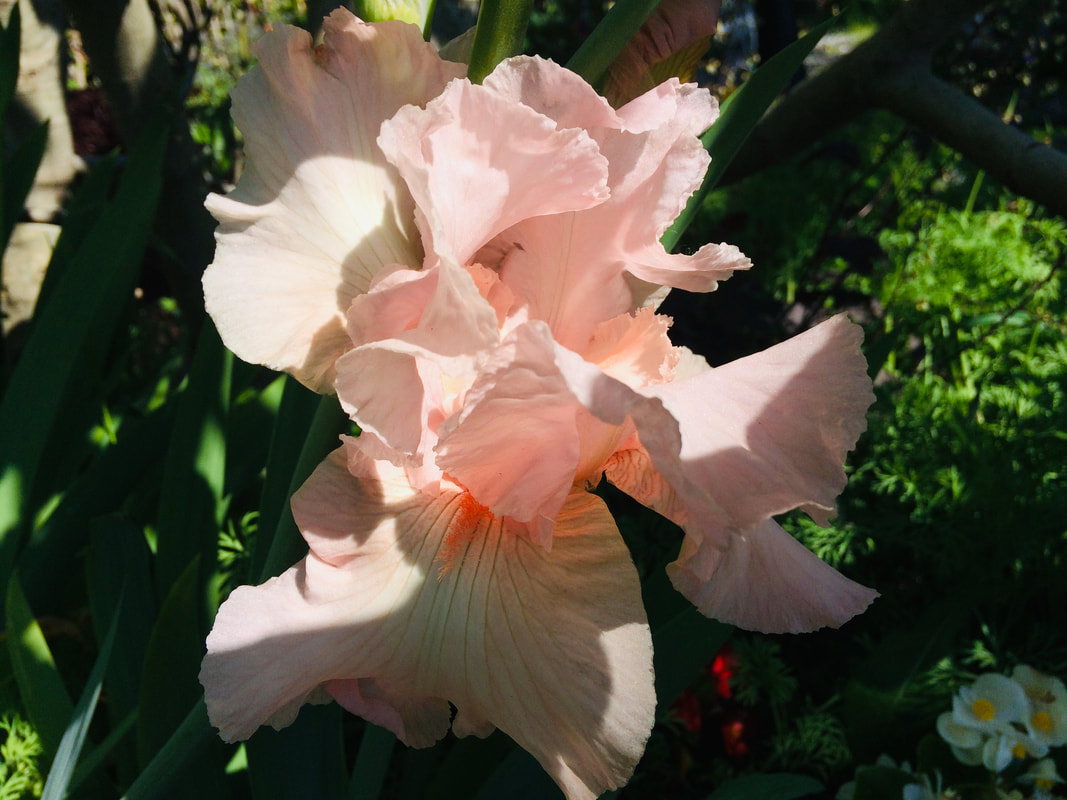
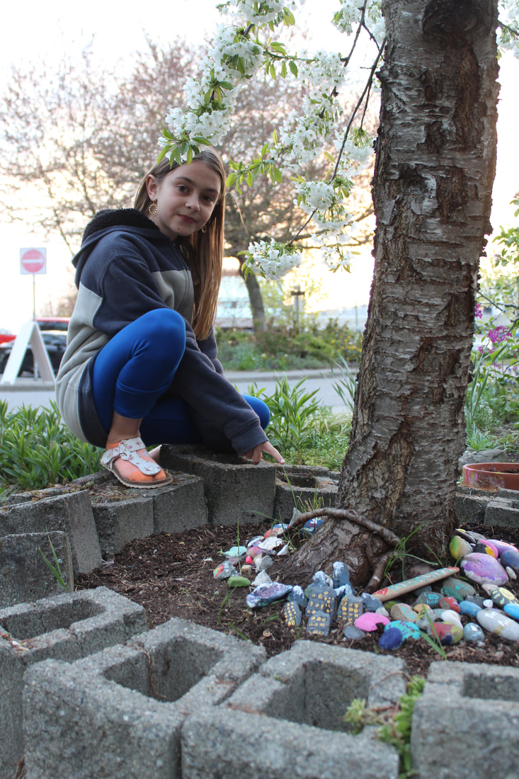
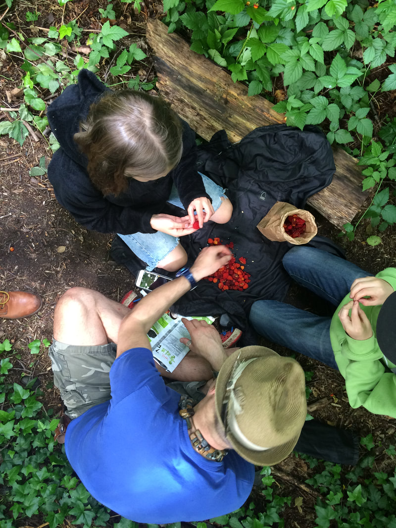
here is the link to make your own: yearbooksigning.jostens.com We are keeping busy with more fort building, meeting cute puppies on walks, taking pictures of nature, painting rocks, collecting salmon berries and setting up an art studio/work space for me!
contrast + juxtaposition overview In this project, we are going to look at two words, contrast and juxtaposition. These words relate to each other because they refer to things that have differences. We will juxtapose images by putting together contrasting elements to see what happens. contrast: an obvious difference between two or more things juxtaposition: the act or an instance of placing two or more things side by side often to compare or contrast or to create an interesting effect Most people will say that 1+1=2, but I think 1+1 can also equal 3. Here is what I mean. In art, you can take two different elements, juxtapose them to produce a third. The viewer will think about what the individual elements mean, and then, by seeing them together, what new meaning is born by combining them. guiding questions: Does the combination of two or more images create new meaning? Does it change the way we see the images when they are presented individually? Uğur Gallenkuşinstagram: @ugurgallen website: LINK Uğur Gallenkuş is a Turkish photographer that creates images and meaning through juxtaposing social contrasts. You should know his work can be graphic and challenging if you wish to look further. He exposes difficult realities that exist in our world. A good way to find more inspiration is to search ‘juxtaposition photography’. what you have to do:
-How much effort did you put into finding (shooting) the images you use? -Did you take care in assembling your images, or did you just slap it together? -How is the lighting and picture quality? -Did you follow the instructions listed above? This project was due Friday May 15th. Please email your work to [email protected] Haring clothes overview This project will explore the artist Keith Haring. He was a street artist in New York and created a very distinct visual style. Many of you will recognize the kind of figures that he made famous, and many have used this kind of imagery since. One of the most recognizable elements of his work is his comical human figures. In this project, you will be finding 2 different works of his that contain his iconic human figure. You will replicate those images with your clothes (socks, towels, hats...) on the floor! Keith Haring’s BIO from Artsy.net Bridging the gap between the art world and the street, Keith Haring rose to prominence in the early 1980s with his graffiti drawings made in the subways and on the sidewalks of New York City. Combining the appeal of cartoons with the raw energy of Art, Brut artists like Jean DuBuffet, Haring developed a distinct pop-graffiti aesthetic centred on fluid, bold outlines against a dense, rhythmic overspread of imagery like that of babies, barking dogs, flying saucers, hearts, and Mickey Mouse. what you have to do:
what are you marked on: -The pdf or word document that shows the reference works, your versions, and the 3 facts you found. -The effort put into selecting, arranging, the clothes to replicate the artworks you are referencing. -The effort put into taking the images. It is important not to take a junky picture of your work. Not all cameras/phones are the same but you should be able to craft a nice image of their work. This project was due on Friday May 15th. Please submit work to [email protected] see 3 sample projects below: 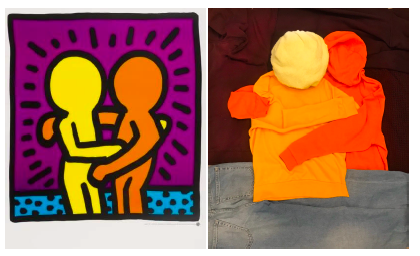 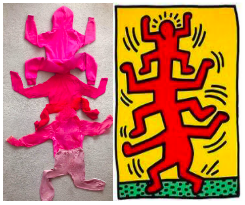 social distancing
overview: In this project, we will be looking for evidence of ‘social distancing’ in your home, outside your home, in media… what you have to do: 1 First, think of where you would see ‘social distancing’ ...inside stores? outside on a sunny day? in a parking lot? My local grocery store has arrows on the ground dictating where to stand when waiting for the cashier. This would make for a great photo and you wouldn’t have to ask anyone to be in the picture! For this image I would play with different angles and maybe one pair of feet to make it more interesting! 2 Make a list of things that you could use as props for the photograph (plastic gloves, masks, hand sanitizer, newspaper clippings…) 3 Will there be people involved? or just inanimate objects? 4 Shoot several photos, the more you take the more you can edit them down to a few fabulous pictures! 5 Submit your 1-3 photos to me via my email: [email protected] This project will be due in two weeks >Friday May 01st. -We have plans to have two whole spreads in the supplementary pages that are for Covid-19 so we need your photos to make it look great and to tell this important story. Images will be juried and those selected will be put into the yearbook. - What are you marked on: -How much effort did you put into finding/setting up your images? -How is the lighting and picture quality? -Did you follow the instructions listed above? see sample photograph below: -I took this image on the Seawall in False Creek, just down the road from my place. spot the difference
overview: In this project, we will be creating our own ‘spot the difference’ puzzles by using everyday objects or environments. A ‘spot the difference’ puzzle is a comparison of two similar images, but there are subtle changes of differences. The challenge is to find all of the differences. See the samples below. The way that you construct the puzzle is up to you. It can even have a theme. You can take a picture of a large space like a room, yard, or forest, or a small space that you can layout an array of objects. It is not required but can also use photoshop or other photo editing applications to change the colour of things or add other effects. Here is a Photoshop-ish online application if you want to give it a try...LINK what you have to do follow the instructions! you may lose marks for not getting things done as listed below. 1 First, think of the kind of setting you want to use...inside? outside? big space? small space? 2 How many ‘differences’ will the images have? YOU MUST HAVE AT LEAST 10. 3 Will there be people involved? or just inanimate objects? 4 What techniques will you use to make the ‘differences’ or ‘changes’? exchange objects for other objects? Remove/add objects? Move objects? Use photo editing software? Can you think of other ways of making changes? 5 Find a way to stabilize your camera/phone so the pictures are identical. 6 MAKE SURE YOUR EXPOSURES ARE THE SAME. Even if you use a phone there is a way to lock the focus and exposure. Look it up online. It is very distracting if the images are different colour temperatures and exposures. 7 Make it solvable! don’t take a picture of a dirt pile and move grains of sand! 8 After you shoot and are happy with them, place the images in a .pdf file laid out like the samples provided. The pages should be 8.5” x 11”. Set the page to landscape or portrait to best fit your two images side by side. 9 Submit your pdf to my email: [email protected] Make sure you include in your email the number of 'differences' in your image!! This project will be due on Friday May 1st.- What are you marked on -How much effort did you put into setting up your images? -How is the lighting and picture quality? -Did you follow the instructions listed above? See sample photography from the highlighted artists on the blog: Artist Denisse Benitez: photo-spot-the-difference-artist-1.html Artist Vikky Alexander: photo-spot-the-differencegt-artist-2.html word collage
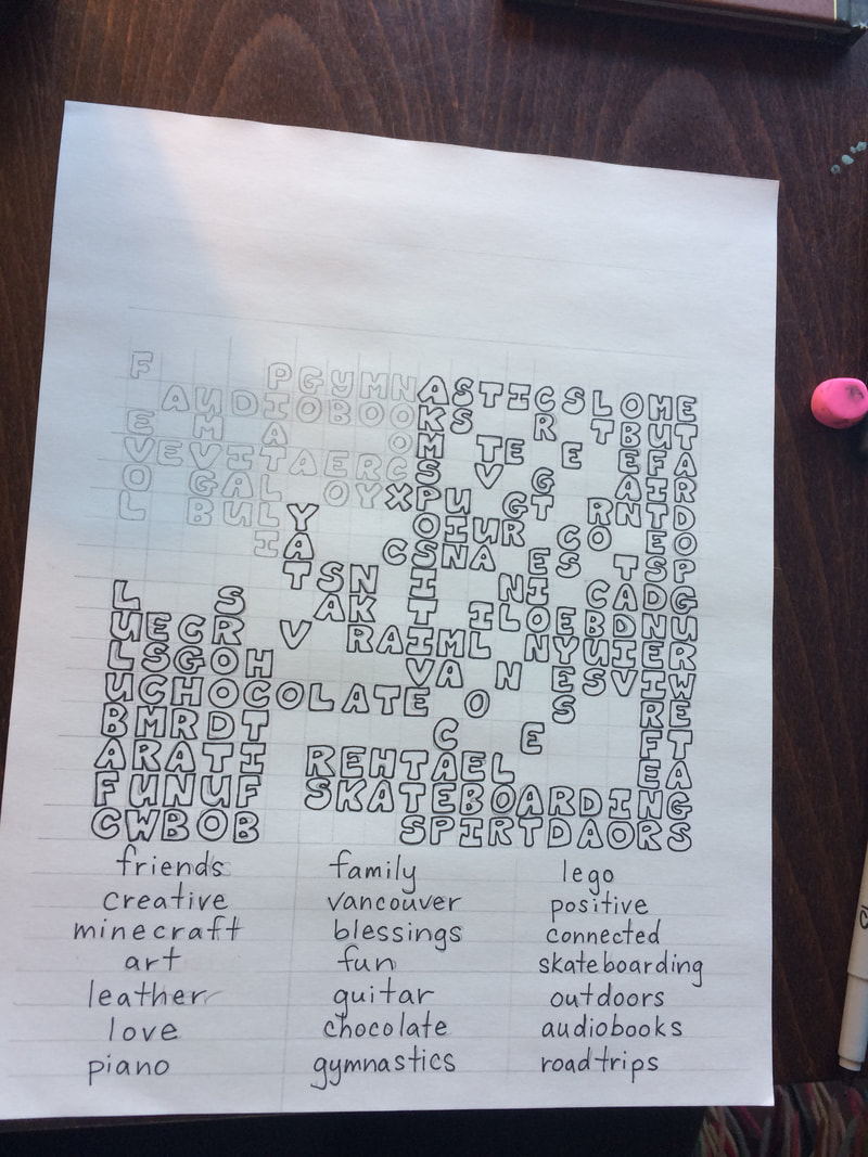
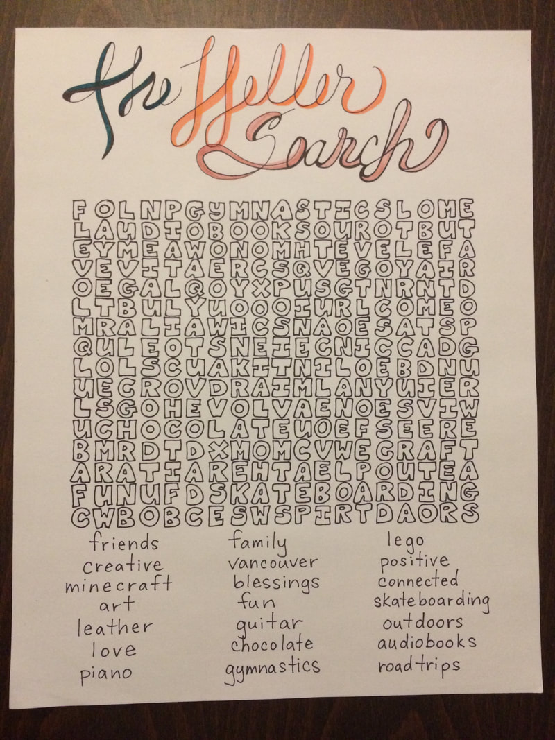
Life is full of challenges, we are so diverse that each of us reacts differently to the rough spots in life. In this project, we will choose a word or words that reflect a reaction to something challenging. Some of you will respond to the COVID situation, but it is not required. You are free to focus on other challenges of being a young person in today’s world. A word that keeps coming back to me during this pandemic is uncertainty. ‘we will see’, ‘it's hard to tell’, or ‘we don’t know’ are answers I hear a lot when someone has questions. These responses make me think of the word uncertainty. word examples: misunderstood: as a young person sometimes it feels like the world doesn’t understand how to treat me. Sometimes I’m treated like a young adult, sometimes as a kid. cabin fever: feeling frustrated because I can’t leave home, or get out to do the activities I like to do. endlessly waiting: fill in the blank, there are many things you can be waiting for. extremely bored: I’m stuck at home and not able to do the things I like. perseverance: I’m going to get through this next phase and get the most out of it. silver lining: this may be hard now but there is a lot of good that will come out of it. optimism: I like to think this is all for the best and it will turn out well. family: During this ‘isolation time’ I have spent more time with my family and it is great to have that time. what you have to do: 1 First, you will need to pick your word(s). 2 Gather materials, anything with letters will do...magazines, newspapers, packaging (cereal/pizza boxes)... you will have to be creative!! 3 Start cutting or tearing out your letters and arranging them into your chosen word(s). You should have enough letters for 6 or more sets of your word(s). 4 Cut more letters than you need, it will be handy to have choices when you start putting them together 5 Test fit your letters before you glue. 6 Think of your word(s) and see if you can choose letter styles that will help convey the message...large for loud, bright colours could mean excited, black and white could convey ‘blah-ness’. 7 If it looks like you will need space larger than a sheet of 8.5” x 11” find a larger surface to layout your words...poster board, cardboard, anything! 8 If you do not have glue, or if you have an interesting surface that relates to your word(s) be creative and lay them on something else. Remember you will want to choose a place where it won’t be disturbed while you work. 9 You will need to take a photo of the work to submit it to me so choose a place that has good lighting. Take detail (up close) pictures of the parts of the collage you are proud of! 10 Your final submission will be a digital picture, taken with a camera or phone...AND...You will also submit a pdf or word document with three sentences that explain why you chose the word(s)? Why is that important to you? What does the word mean to you in relation to the challenge? 11 Please submit your Images and documents to my email: [email protected] This project should take two weeks to complete. It’s more work than you think so start early! What are you marked on: -The pdf or word document that describes why you picked the word(s), and how the word(s) relates to you. -Use of space. Does your collage fill the page nicely? Does it look like you took the time to arrange it? or did you just throw it on the paper to get it done? -Does it look like you put some effort into the project? did you fun with it? -How creative was your use of different letters to spell the words? -How creative was your layout? This project will be due on Friday May 1st.- See sample projects and examples from the hightlighted artist on the blog Artist Greg Lemarche~art-class-word-collage-artist-1.html Here is your first project to keep you busy if you have already finished your assigned work for the week! The 'keep you busy' projects are not for marks but are supposed to inspire and keep you active in being 'the Creative'. These projects will be posted on the blog -not in the classes section. Choose the 'keep you busy' category to find a new project you haven't done before! Please share with me what you have come up with by sending me an email of your work! -keep you busy #1 For this assignment I would like you to create a word search. Decide what the theme of the word search will be and start listing words you would like to use. I decided to make a word search about my family. I made a 19 across/ 16 down grid in pencil (pressing very lightly, as I planned on erasing it after). Then I started to hide my 21 words into the grid (backwards, across, down, and diagonal). *Be sure to hide the larger/longer words first so you have room! Please share your results, have fun!
Every school year is a different, every yearbook will have different memories and pictures. This year is no different - actually, IT IS more different because of where we find ourselves because of COVID-19. Get your 2020 book now at richmondsd38.schoolcashonline.com/
|